We look at the pros and cons of each office style, from cubicles to pods.
Office layout isn’t just about cramming in as many desks as possible until you have to hold your breath to squeeze between them.
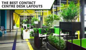
Your office layout can help or hinder your day-to-day tasks and it can affect the entire working atmosphere of your call centre.
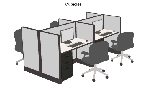
1. Cubicles
A common option that consists of a large desk divided by panels to create individual square workspaces for each agent.
Pros
- Efficient use of floor space – Anyone who’s ever played Tetris will know that square blocks waste the least space. This makes it convenient for cabling too.
- Noise reduction – Panels reduce background noise, helping agents focus on customer calls without distractions.
- Cost effective – The furniture is relatively cheap to buy and gets the most out of what you pay for office space.
Cons
- Feels lonely and claustrophobic – While effective for focus, cubicles can feel isolating. The enclosed design may reduce interaction and make agents feel disconnected from colleagues.
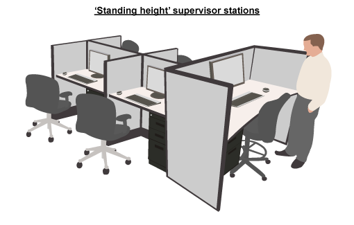
2. ‘Standing Height’ Supervisor Stations
An elevated desk that seats a supervisor a few feet higher than the rest of the office. Kind of like a sitting at a bar, but with fewer elbows and drink spillages.
Pros
- Enhanced visibility – Being elevated makes it easier for supervisors to monitor team activity, spot issues, and assist agents when needed.
- Ease of movement – Supervisors are forever getting in and out of their seats – working on their computers and walking the floor. Being already at standing height makes it less of an ab workout.
Cons
- Loss of privacy – The open view works both ways. Without panels, supervisors lack privacy, and their conversations can be easily overheard.
- Can feel intimidating for agents – This is more of a body language thing – sit at a higher desk than your agents and you’re literally ‘looking down on them’.
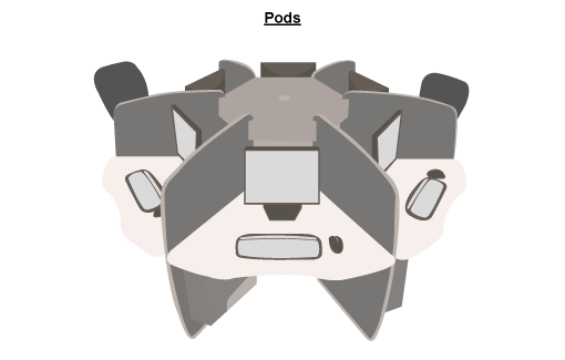
3. Pods
A circular or hexagonal-shaped desk in which the workspaces are separated by panels into ‘pizza slices’.
Pros
- Open and collaborative feel – Compared to square cubicles, pods feel much more spacious and collaborative. Supervisors can see much more of what’s going on too.
- Aesthetic appeal – Rounded or hexagonal shapes are visually appealing and can make the workspace feel less rigid. The centre of each pod can hold plants or decor to personalize the area and add a touch of creativity.
- Good use of desk space – The trapezoid-like desk shape in pods allows for comfortable arm reach, providing ample elbow room and minimizing wasted desk space.
Cons
- Lower space efficiency – Can you imagine throwing a hexagon into a game of Tetris? They’re not space efficient – square cubicles will always give you more agents in one office than hexagonal pods will.
- More expensive – Pods tend to be more costly to set up than cubicles, and with fewer agents per square foot, the space-to-cost ratio can also be higher.
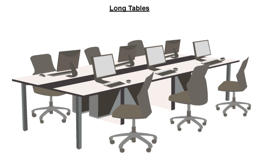
4. Long tables
Just a long table with agents sitting along it.
Pros
- Cost-effective – Basic tables are affordable and ideal for companies looking to minimize furniture expenses.
- Great for collaboration – Without dividers, agents can easily communicate, creating a team-oriented atmosphere that’s ideal for collaboration.
- Easy to move – Lightweight tables on wheels make it easy to rearrange the workspace as needed, adapting quickly to new layouts or team configurations.
Cons
- Noise levels – In an open set-up without panels, background noise can become a significant issue, making it harder for agents to concentrate and hear customers clearly.
- Cable management challenges – Long tables often lack built-in cable management, which can lead to tangled wires. This set-up is less practical for desktop computers or wired headsets.
Modern Call Centre Layout Strategies
Zoning for Focus and Collaboration
Establish specific zones, such as quiet areas for focused work and open pods for teamwork. This layout reduces distractions for concentrated tasks while enabling quick, effective team discussions in shared zones.
Flexible Desks
Modular, movable desks let teams adjust their layout for different projects. This set-up allows space to shift between individual tasks, team huddles, or large meetings without needing permanent structural changes.
Sound Absorption Features
Add partitions, acoustic panels, or greenery to absorb noise in open layouts. This helps maintain a quiet environment while allowing teams to stay visually connected.
Comfort Break Areas
Designate comfortable break spaces with soft seating, plants, or calming decor. These areas allow employees to unwind, helping reduce burnout and promote relaxation between calls.
So What’s Your Priority?
- If you need to keep costs down, go for cubicles.
- For a pleasant, interactive office environment, try pods.
- If you need to watch your agents like a hawk, sit at a raised desk.
- If your office layout is forever moving around and you really need to keep costs down, stick to the good old-fashioned long tables.
For more on ways to design and arrange your call centre, read these articles next:
- 10 Ways to Personalize an Agent’s Desk
- Six Clever Ways to Design Your Call Centre
- Creative Ideas for Call Centre Office Design
Author: Megan Jones
Reviewed by: Hannah Swankie
Published On: 31st Oct 2024 - Last modified: 21st Jan 2025
Read more about - Call Centre Management, Design














I totally agree with the choice of Pods.
The configuration is flexible, you can have as few as 4 or as many as 6 individual stations, and these were all able to be completed using standard product sizes.
Be sure that your panels are the noise reducing type, and you will be amazed and the reduction in overflow conversations.
Our teams loved the bit of extra space behind their monitors – we added plants, task lights, etc. to meet their individual needs and improve the esthetics.