A call centre wallboard (or LCD/ plasma display) is fairly inexpensive. You can buy a display for as little as £1,000.
But before you invest that money, there are some questions you should first consider.
What is your goal?
Did you know that putting up a display can actually cause harm and disruption to your workforce? If you don’t have a clear idea of what you want the board to communicate, then it will either be ignored or distracting, both of which you cannot afford.
Every time an agent looks up from his/her desk to read information, valuable seconds are spent. If the information is not highly targeted and easily interpreted, those seconds are wasted. On the other hand, if the information is simple and quickly grasped, those seconds can be well spent and result in better performance. But first know the goal.
Agents in blended centres with multiple goals and types of transactions need to keep their attention on the desktop. You may want to consider a screen pop as an alternative; one that does not take up much real estate.
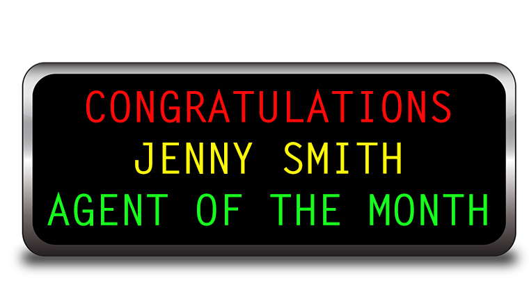
Top tips to include on your wallboard
Less is more
Most experts adhere to the science of display, which states that at any given time an agent cannot handle more than seven pieces of information. That means that the display should be simple, with as few text messages as possible. Metrics should be quickly grasped and not require the viewer to calculate anything or wait for data to refresh. Once again, those few seconds need to work for your team, not against them.
Metrics that work harder
Service level, number of calls in the queue, number of calls abandoned… those are some of the metrics that we immediately think of when we imagine our new display blinking away. They are important metrics, to be sure, as they represent the heartbeat of the centre. But today’s technology enables us to deliver a richer set of metrics that can be a product of several sources of information.
Tight thresholds
Thresholds should be created that cause the metrics to change colours as performance is impacted. You should always create an upper and lower threshold, so that you can reward positive goal-reaching behaviour and adjust poor performance quickly. Don’t ignore differences in call volumes for different times of the day and days of the week. Take the time up front to set intelligent thresholds and you will be rewarded by less data, but better data.
Avoid more than six metrics at any given time
Avoid more than six metrics at any given time. Information should be flashed, not scrolled. Scrolling requires the viewer to ‘wait and watch’. It wastes time and is tiring on the eyes. Keep it simple and consistent.
Avoid special effects
The exploding stars and cute characters walking across the display are so much fun. But they do one thing only… distract your expensive workforce. Save them for the after-hours party to celebrate a goal met or a birthday.
The Long and Winding Message
Phew! What did that say again? Don’t use a display to teach or entertain! Think of the money you spend every second on your workforce. There are training videos and programmes that can be scheduled, there are parties that can be organised. The display should have no personality except to briefly correct or encourage. Keep messages short and clear. ‘Great job, keep it up!’ Rule of thumb, messages should be readable in two seconds. Anything longer than that belongs in a phone call, report or email.
Make it easy to see
Make sure that your agents can see the display easily. Ergonomics may dictate higher cubicle walls or floor layouts that make viewing a display more difficult. They should be mounted high enough on the wall so that they can be seen without moving the head. A quick glance should be all that is needed by the viewer.
If you have frequent visitors to the contact centre, you might want to consider a plasma or TV monitor placed out of view of the agents but on a wall easily viewed by a visitor. These displays are great for showing an overall performance picture. A little dazzle is appropriate here; the more graphics and movement, the better.
Beware the false sense of security
Remember that displays are hardware, nothing more. They are only a conduit for information. If the data and metrics behind that information are not accurate and reflective of team goals, the information on the board may hinder performance. Unfortunately, many managers are lulled into a false sense of security, ‘There, I have the board up, I’m all done!’
Remember the display is a communications device, an extension of a greater plan. It can be used to communicate very specific, simple metrics that can help shape behaviour to meet your goals.

Susan Saldibar
Susan Saldibar is VP Marketing and Sales for Centergistic Solutions
Don’t forget to check out our Wallboard PowerPoint Generator to deisgn your own wallboards
Author: Jo Robinson
Published On: 17th Mar 2010 - Last modified: 10th Sep 2018
Read more about - Technology, Wallboards












We work with some great contact centres here in the UK and our experience is that the majority of contact centre managers do have a clear idea of what they want to show on the screens, but as you quite rightly point out it is a question of what’s relevant to the target audience.
So much information is available, and agents desktops tend to be overcrowded with open applications that wallboards are a really effective way to show headline information in an easy to read format.
We know that the most eye catching effect on any screen are colour changes that relate to preset thresholds. Agents don’t even need to read the text, as long as the data is in the same place they learn to react to areas of the screen changing colour and respond accordingly.
Using our content management software, call centres are able to split the screens into sections and manage each area independently. Typically a quarter of the screen is dedicated to agent incentive content, the best practitioners of this are Vanquis Bank who promote internal competitions based on agent performance, and a soft drinks company who show outbound telesales campaigns in conjunction with new product information to keep agents informed when making sales.
Other companies use some of the screen for TV, especially during quiet periods or when there is a major sporting event such as Wimbledon or this year, the football World Cup. This always creates some interesting discussion on whether this is an incentive, i.e. stops people from taking ‘sick’ leave or a distraction, performance figures fall through the floor. Our non scientific research concludes that the positives outweigh the negatives.
Martin Brown
Sabercom
We are planning to install a big screen in the call center more for entertaining purposes and for especially for the quiet hours of the day (we operate 24h). We already have 2 screens that display alerts and special announcements. with the 3rd screen our main goal is to keep agents guiet and busy to avoid using internet or their mobiles.I have a few concerns though.e.g Will this distract the agents more than keep them quiet ? What should the TV shows ( our company has its own TV 50+ channels). Should be keep it on only during certain times (at night, during holidays etc) all at all times? Please share your thoughts.